
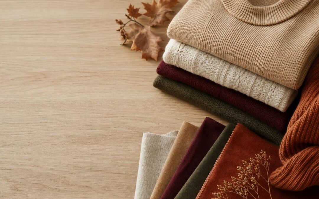
I figured out my fall color palette the hard way — by standing in front of a closet full of clothes that technically “matched” and feeling like none of it looked right. Everything was black, grey, and one hopeful mustard sweater I never actually wore. So a couple of autumns ago I stopped buying random seasonal pieces and started building around a deliberate palette instead, the way you’d plan a room before painting it. This year my fall color palette leans into warm, grounded, slightly moody tones, and building around them has made getting dressed on a cold morning almost effortless. Here’s the exact palette I’m wearing all season, why these shades work together, and how to build a wardrobe around them without buying anything you’ll regret.
Why a palette beats a pile of “fall colors”
For years I thought dressing for fall meant collecting anything vaguely autumnal — a rust top here, a burgundy scarf there, an olive jacket that went with nothing else. The result was a closet full of individually nice pieces that refused to cooperate. The shift happened when I started thinking in terms of a coordinated palette: a small set of shades chosen specifically because they layer and swap with each other.
The logic is the same one interior designers use. You pick a few base neutrals, a couple of richer “anchor” colors, and one or two accents, and you make sure they share an undertone so everything blends. Once your colors share a common temperature — in fall’s case, almost always warm — you can throw on any two pieces half-asleep and trust they’ll work. That’s the real payoff. A palette isn’t about restriction; it’s about buying yourself the freedom to stop thinking so hard at 7 a.m.
The warm neutrals doing the heavy lifting
Every palette I build starts with neutrals, because they’re what you’ll actually wear most days. For 2026 I’ve moved away from stark black-and-white and toward softer, warmer neutrals that feel more expensive and more forgiving against autumn skin.
Warm camel and toffee
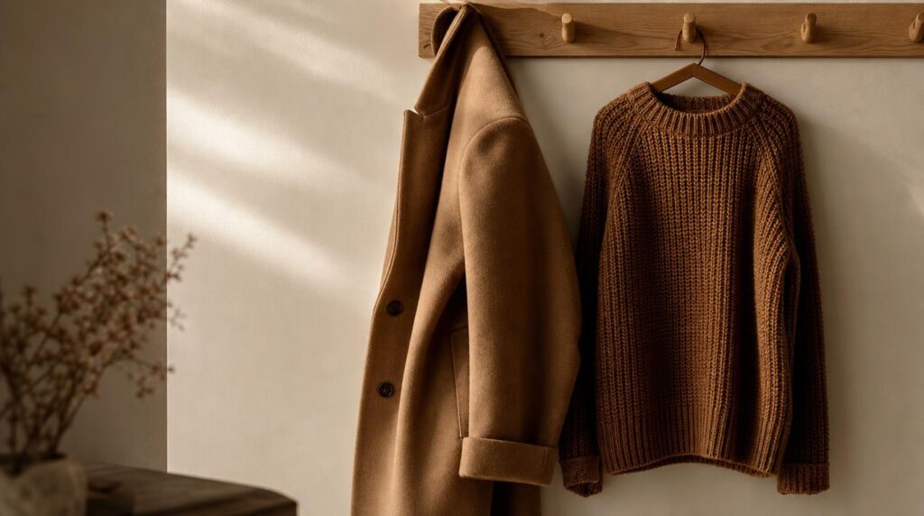
Camel is the backbone of my entire fall wardrobe, and I’d argue it’s the single most useful color you can own. It reads as polished as black but so much softer, and it flatters nearly everyone because its warm, golden undertone echoes the light this time of year. I lean on it in a wool coat and a chunky knit, and both go with every other color in the palette. When I want a little more depth, I reach for toffee — a darker, caramel-leaning brown that layers beautifully under camel without the harsh line black would create against it.
Cream and oatmeal instead of white
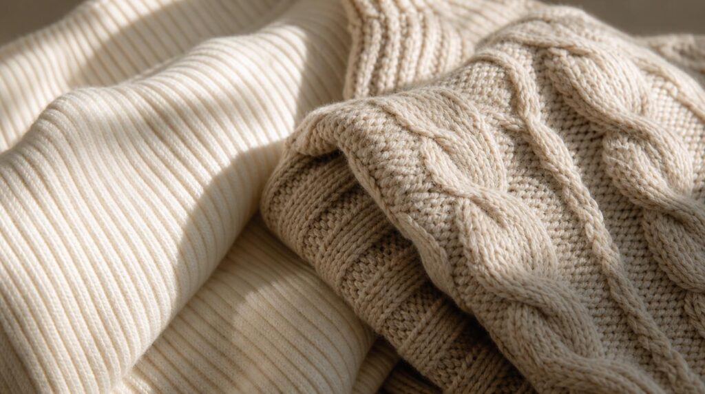
I’ve retired crisp white for fall in favor of cream and oatmeal. The difference sounds subtle but it changes everything: a warm off-white sits comfortably next to camel and rust, where a cool bright white would fight them and look faintly out of season. A cream ribbed knit or an oatmeal-toned cable sweater is my go-to base layer, and the slightly nubby texture of a brushed or ribbed knit adds warmth to the eye as well as the body.
The rich anchor colors that make it feel like fall
Neutrals keep a wardrobe wearable, but the anchor colors are what make it feel like autumn. These are the deeper, saturated shades I build outfits around when I want to look like I tried, even when I didn’t.
Burgundy and oxblood
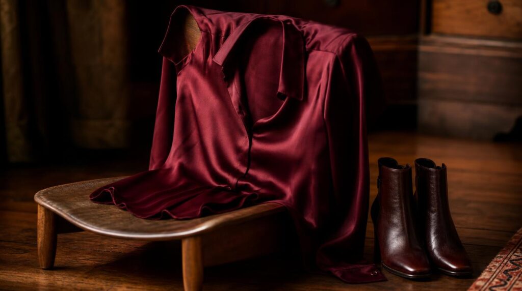
If I could only add one color to a neutral base for fall, it would be burgundy. This deep, wine-red is having a genuine moment for 2026, and for good reason — it’s dramatic without being loud, and it turns a plain outfit into something intentional. I wear it in a silky blouse under a camel blazer, or as an oxblood boot that pulls a whole look together. The trick with burgundy is texture: in a fluid fabric like silk charmeuse it feels elegant and grown-up, while in a matte knit it reads cozy and casual. Same color, two completely different moods.
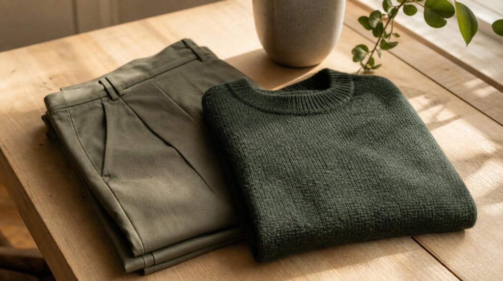
Forest and olive green
Green is the color I reach for when I want depth without red’s boldness. A deep forest green feels rich and a little unexpected, while olive is practically a neutral in disguise — it pairs with camel, cream, and burgundy without any effort. I love olive in a utility jacket or wide-leg trousers because the muted, slightly grey-green undertone keeps it from looking too “outdoorsy.” Green and burgundy together, over a cream base, is my favorite combination of the whole season; they’re near-opposites on the color wheel, so they create contrast, but their shared depth keeps it sophisticated rather than jarring.
Rust and burnt orange
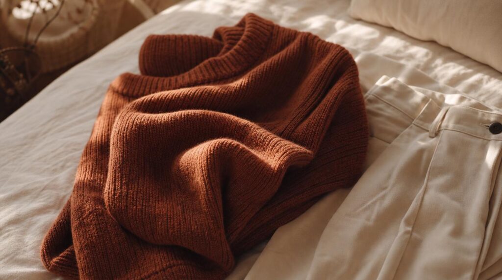
Rust is the color everyone thinks of for fall, and it earns its reputation — it’s literally the color of the turning leaves. But the mistake I see (and used to make) is choosing a rust that’s too bright or too orange, which can look cheap. The version that works is a burnt, slightly muted terracotta with brown in it, which sits harmoniously beside camel and toffee because they share that same warm-brown base. A rust knit with cream trousers is autumn in a single outfit.
How to actually combine these shades
Owning the right colors is only half of it; the other half is knowing how to put them together. I use two simple approaches depending on the mood I’m after, and neither requires any real fashion knowledge.
The first is tonal dressing — building an outfit from different shades of the same warm family. Think camel trousers, a toffee knit, and cream accessories. Because everything shares an undertone, the look reads calm, elegant, and expensive, and it’s nearly impossible to get wrong. The second is intentional contrast — pairing one anchor color against a neutral, like burgundy with cream or forest green with camel. Here you let a single rich color do the talking while the neutral gives your eye somewhere to rest. The failure mode to avoid is piling three or four saturated anchors together at once; that’s when an outfit tips from rich into chaotic. My rule of thumb is one hero color, everything else supporting it.
Building the wardrobe around just four colors
You genuinely don’t need all of these to have a working fall wardrobe. If I were starting from scratch, I’d pick four — one warm neutral (camel), one soft base (cream), one anchor (burgundy), and one wildcard (olive or rust) — and buy versatile pieces in those before anything else. A camel coat, cream knit, burgundy blouse, and olive trousers can already make a week’s worth of outfits, because every piece coordinates with every other. Start there, live in it for a few weeks, and only add a fifth color once you know where the actual gaps are. That’s how you build a wardrobe you wear instead of a closet you apologize for.
What I’ll be reaching for all season
The reason this palette works isn’t that these are trendy shades, though several of them happen to be having a moment. It’s that they all live in the same warm, grounded family, which means they cooperate with each other and with the golden, low autumn light. Camel and cream for the base, burgundy and forest for drama, rust and olive to keep it interesting — that’s the whole story, and it fits on a sticky note.
If your fall closet feels like a pile of clothes that never quite come together, try choosing five shades on purpose and giving away the pieces that don’t belong to any of them. It felt slightly ruthless the first time I did it, and it’s the best styling decision I’ve ever made. A small, warm, coordinated palette doesn’t shrink your options — it hands you a season of outfits you can put together with your eyes half closed.